logo

William Zhu

Data Scientist by Training
& Social Scientist at Heart


Exploring Variations in Divvy Bike Stations' Usage Volumes

[Data and Code]

Introduction

Divvy bikes is a public bike sharing service in Chicago operated by Lyft for the Chicago Department of Transportation. Launched in 2013, Divvy bike share currently has 681 bike stations and about 337 thousand monthly riderships (as in April 2021). Riders can process bike rental in two ways: casual riders can rent out divvy bikes from stations using a one-time check-out system installed in the station. Members can rent out divvy bikes by scanning the QR code on each bike from their Lyft app on their phone.

Figure 1: network graph of Chicago Divvy bike stations and trips (April 2021)

Figure 1 shows the network graph of Divvy bike trips. Each node represents a bike station, and the width of every undirected edge between two nodes represents the number of trips from one station to the other. We can clearly see that bike stations vary widely by usage volume. In this project, the usage volume of a divvy bike station is defined as the sum between the number of station-to-station divvy bike trips in April 2021 that started at the station and those that ended at the station. Stations in downtown and the northside of Chicago are more popular than those in other areas. Though stations are well distributed at the westside and southside of Chicago, Hyde Park is the only neighborhood in the southside of Chicago with high Divvy bike usage volume in April 2021.

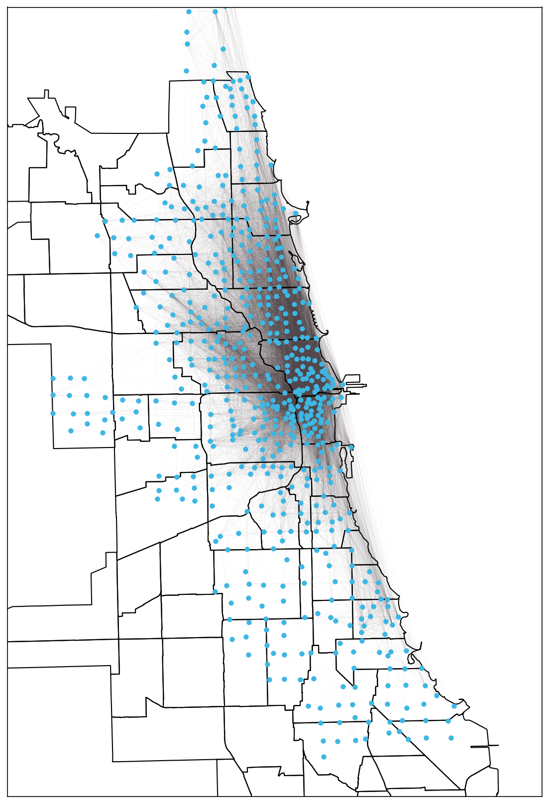
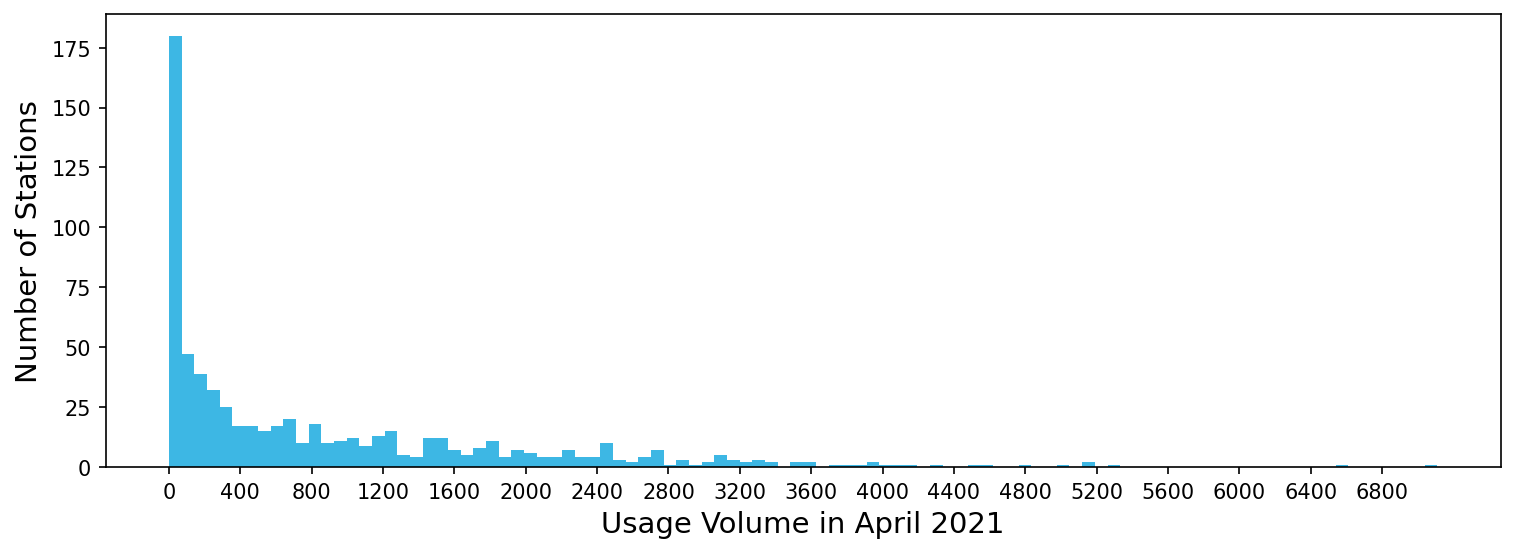
Figure 2: distribution of divvy bike stations by usage volume (April 2021)

Figure 2 shows the distribution of divvy bike stations by usage volume, which ranges quite widely. Some stations were used only once in April 2021, while the most popular station was used 7109 times. What factors contribute to the variations in usage volume among divvy bike stations?

To answer this question, this project formulates 6 groups of hypotheses on factors that may potentially affect usage volume of divvy bike stations. To test these hypotheses, the project compiled a station-level dataset from a wide range of databases, including Divvy historical trip records (April 2021), the City of Chicago Data Portal, US Census (2010), and Zillow Research. Results show interesting associations between the usage volume of divvy bike stations and factors including network effects, crime rates, socio-economic status, and demography. The following blog post is composed of three sections:

  • Section one provides a brief descriptive overview of Divvy historic trip data (April 2021), which is the primary dataset for this project.
  • Section two introduces six groups of hypotheses and describes how relevant independent variables are collected and measured.
  • Section three discusses the results of hypothesis testing using multivariate OLS regression models.

Overview of Divvy historic trip data (April 2021)

The Divvy historical trip data stores information on every divvy bike trip since 2013, including start and end station names, coordinates, and time stamps. The April 2021 Divvy historic trip dataset records 337,230 trips in total, among which 298,207 trips were from station to station.

Figure 3: distribution of station-to-station divvy bike trip by date (April 2021)

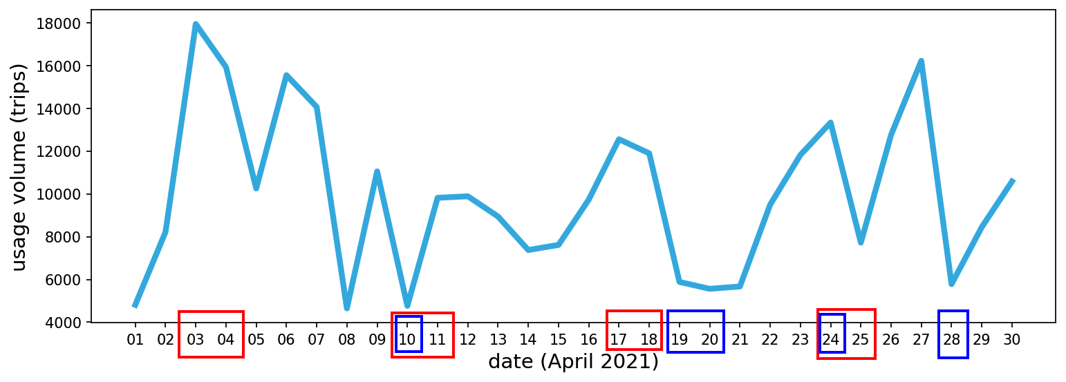
Figure 4: distribution of station-to-station divvy bike trip by hours of the day (April 2021)

Figure 3 shows the distribution of Divvy bike trips by date in April. We can see that the number of bike trips spiked during weekends (highlighted in red boxes) and decreased on rainy days (highlighted in blue boxes). Figure 4 shows the breakdown of bike trips by the hours of the day. It is clear that Divvy bike usage peaked during the afternoon hours (3pm to 7pm). In April 2021, 681 Divvy bike stations were used (to check out or return a bike) at least once. Figure 5 shows the top 10 most used Divvy Bike stations in April. As expected, all of them are located in the downtown area and close to the lakeshore.

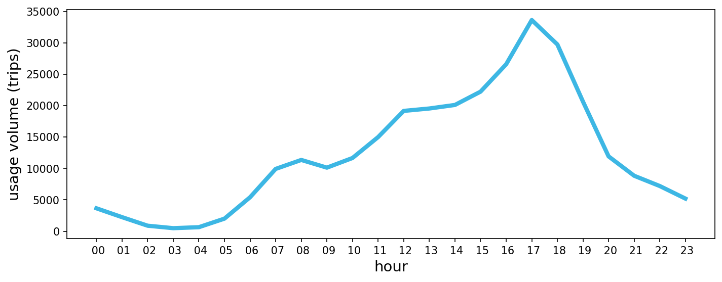
Figure 5: top 10 divvy bike stations with the highest usage volume (April 2021)

Introducing the six groups of hypotheses

Hypotheses Group 1: location and purpose

It is likely that bike stations in certain locations mainly serve users with a particular purpose. For example, bike stations located near tourist attractions are mainly used for sightseeing. Stations along a long bike trail are used for exercising. Stations in residential areas are used for commuting. These locations and user objectives may impact the volume of station usage. Tourist sites are likely to attract more bike traffic than residential areas or long bike trails. Here are the hypotheses:

  • H1a: Stations with a high proportion of riders who pay one-time fees, which signal proximity to tourist sites, are positively associated with usage volume.
  • H1b: Stations with high average trip distances, which signal proximity to long bike trails, are associated with low usage volume.
  • H1c: Stations with a high proportion of morning or weekday usage, which signal proximity to residential areas, are negatively associated with usage volume.

Table P1: variables for Group 1 hypotheses

Variables Meaning
total_count usage volume (the sum between the number of station-to-station divvy bike trips in April 2021 that started at the station and those that ended at the station)
casual_p the proportion of trips in the station's usage volume that are paid via one-time check-out system
average_distance the average Euclidean distance (in decimal degrees) between the start station coordinates and end station coordinates of trips in the station's usage volume
weekday_p percentage of trips in the station's usage volume that took place during the weekdays
morning_p the proportion of trips in the station's usage volume with a start time recorded in the morning (6am to noon)
evening_p the proportion of trips in the station's usage volume with a start time recorded in the evening (9pm to 5:59am)

Data source: Divvy historical trip data (April 2021)

Table P1 lists the variables collected to test these hypotheses. In the station-level dataset compiled from Divvy historical trip data, every row represents a unique divvy bike station that was used at least once in station-to-station trips in April 2021. ‘Total_count’ is the outcome variable, which measures a station’s usage volume. Predictor variables include payment process (‘casual_p’), distance (‘average_distance’) and usage time period (‘weekday_p’, ‘morning_p’, ‘evening_p’). Figure P1 shows the distribution of stations by these variables.

Figure P1: histograms of variables in Group 1 hypotheses

Hypotheses Group 2: crime rates

Figure P2a: top 10 crime categories by number of cases in Chicago (2020)

It is likely that bike stations located in places with high crime rates were used less frequently than those in low crime rate areas. The project collected the Chicago Crime record data in 2020 from the City of Chicago data portal. Figure P2a shows the top 10 crime categories by the number of cases in Chicago (2020). Notice that except for ‘deceptive practice’, the other nine categories all involve physical violence that mostly took place in public streets. In contrast, deceptive practices, which include identity theft and financial fraud, represent white collar crimes that mostly take place in downtown office buildings. Therefore, I separately measure the number of these two types of crime in 2020 that were committed in locations near each bike station. I hypothesize that:

  • H2a: Bike stations with high numbers of physical crime nearby are negatively associated with the volume of usage.
  • H2b: bike stations with high numbers of white collar crime nearby are positively associated with the volume of usage.

Table P2 lists the two variables collected to test the hypothesis. Figure P2 shows the distribution of stations by the two types of crime.

Table P2: variables for Group 2 hypotheses

Variables Meaning
num_phys_crime the number of crime cases (excluding ‘deceptive practice’) within 0.004 degrees (444m) in longitude and latitude of the station (in April 2020)
num_wc_crime the number of ‘deceptive practice’ crime cases within 0.004 degrees (444m) in longitude and latitude of the station (in the 2020 calendar year)

Data source: Chicago Data Portal (Crimes 2020)

Figure P2: histograms of variables in Group 2 hypotheses

Hypotheses Group 3: local supply and demand

The project assumes that the local divvy bike station density and population density represent the supply and demand of each bike station. Having a large supply of bike stations means that each bike station is used less frequently. Having a large demand for divvy bikes means that each station is used more often. Here are the hypotheses:

  • H3a: High bike station density is negatively associated with the usage volume of each station.
  • H3b: High population density is positively associated with the usage volume of each station.

Table P3 shows the two variables that are collected. “num_bike_stations” is measured by counting the number of other divvy bike stations within 0.008 degrees (888m) in the longitude and latitude of the station. “population_density” measures the population density of the zipcode where the station is located. It is accessed via the “uszipcode” python package, which sourced data from the US Census 2010. Figure P3 shows the distribution of bike stations by the two variables.

Table P3: variables for Group 3 hypotheses

Variables Meaning Data source
num_bike_stations the number of other divvy bike stations within 0.008 degrees (888m) in longitude and latitude of the station (April 2021) Divvy historical trip data (April 2021)
population_density the population density of the zipcode where the station is located (2010 Census data) uszipcode python package

Figure P3: histograms of variables in Group 3 hypotheses

Hypotheses Group 4: other public transportations

Chicago has 144 CTA rail stations (as of December 2018) and 10847 bus stops (as of November 2020). These alternative public transportation facilities may have complex associations with bike stations’ usage volume. After controlling for population density, I suspect that there are two conflicting effects: (1) substitution effect. It is likely that bus, rail, and public bike shares serve similar purposes and compete with each other for passengers. Therefore, having many bus stops or rail stations nearby reduces the popularity of a bike station. (2) Complement effect. It is likely that public bike shares are used for shorter distance travel than bus or rail systems. Therefore, passengers may use bike share service often before or after commuting by bus or rail. For this reason, having many bus stops nearby or close to rail stations may increase the popularity of the bike stations. I hypothesize that the complement effect plays a strong role:

  • H4: A large number of nearby bus stops or close proximity to a rail station is associated with a high usage volume of the divvy bike station.

Table P4 lists the two variables of interest. “min_dis_rail_station” measures the euclidean distance between the bike station and the nearest CTA rail station. “num_bus_stop” counts the number of bus stops within 0.002 degrees (200m) in both the longitude and latitude from the bike station. Both CTA rail stations and bus stops data were collected from the City of Chicago Data Portal. Figure P4 shows the distribution of stations by these two variables.

Table P4: variables for Group 4 hypotheses

Variables Meaning Data source
min_dis_rail_station the Euclidean distance (in decimal degrees) between the bike station and the nearest CTA rail station (data updated on December 31 2018) Chicago Data Portal (CTA - 'L' (Rail) Stations)
num_bus_stop the number of bus stops within 0.002 degrees (222m) in longitude and latitude of the bike station (data updated on November 9th 2020) Chicago Data Portal (CTA - Bus Stops)

Figure P4: histograms of variables in Group 4 hypotheses

Hypotheses Group 5: socio-economic status

This project suspects that the divvy bike share service is mainly used by the middle class. It is because the residents in disadvantaged neighborhoods may not feel comfortable paying for public bike rides. Meanwhile, the wealthy upper-class population may prefer their own personal bikes or vehicles rather than public bikes. Therefore, I hypothesize an inverse “U” shaped curve for the relationship between socio-economic status and usage volume:

  • H5: As the average home value of a neighborhood increases, the usage volume of bike stations in the neighborhood first increases, then decreases.

Table P5 shows the variable, “average_home_value”, which measures the average home value of the zipcode where bike stations are located. The variable is collected from Zillow Housing data recorded on April 30th, 2021. Figure P5 shows the distribution of stations by home value.

Table P5: the variable for Group 5 hypothesis

Variable Meaning Data source
average_home_value the average home value (SFR, Condo/Co-op) of the zipcode where the station is located (April 30th, 2021) Zillow Housing data (home value index)

Figure P5: histogram of the variable in Group 5 hypothesis

Hypotheses Group 6: demographics

It is likely that the preference of using the public bike share system differs by race and age group. I hypothesize that:

  • H6a: The racial composition of the region affects the usage volume of the bike station located in the region.
  • H6b: A larger proportion of young people in the region is positively associated with the usage volume of the bike stations located in the region.

Table P6 shows the demographic variables collected from the City of Chicago Data Portal (recorded in 2019). Figure P6 shows the distribution of bike stations by these regional demographics variables.

Table P6: variables for Group 6 hypotheses

Variables Meaning
black_p the percentage of population that self-identified as black in the zipcode of the station
asian_p the percentage of population that self-identified as asian in the zipcode of the station
latinx_p the percentage of population that self-identified as latinx in the zipcode of the station
white_p the percentage of population that self-identified as white in the zipcode of the station
age18_29_p the percentage of population with age between 18 and 29 in the zipcode of the station
age30_39_p the percentage of population with age between 30 and 39 in the zipcode of the station
age40_49_p the percentage of population with age between 40 and 49 in the zipcode of the station
age50_59_p the percentage of population with age between 50 and 59 in the zipcode of the station
age65_p the percentage of population with age greater than 65 in the zipcode of the station

Data source: Chicago Data Portal (Chicago Population Counts) (2019)

Figure P6: histograms of variables in Group 6 hypotheses


Table P7 shows the summary table of all variables. Figure P7 shows the correlation heatmap. Here are a few observations from the heatmap: (1) the number of bike stations nearby is highly correlated with the number of white collar crimes nearby. It suggests that places with high numbers in both categories are likely to be downtown Chicago. These two variables are positively correlated with the outcome variable (total_count). (2) the proportion of the white population is highly correlated with the proportion of young people (age 18-39) in an area. These variables are also positively correlated with the outcome variable.

Table P7: summary table of all variables

Variables count mean std min 25% 50% 75% max
total_count 681 875.8 1,084.9 1 62 431 1,335 7,109
casual_p 681 0.48 0.22 0.00 0.32 0.40 0.58 1.00
average_distance 681 0.024 0.008 0.000 0.019 0.023 0.027 0.068
weekday_p 681 0.70 0.11 0.00 0.65 0.70 0.75 1.00
morning_p 681 0.21 0.09 0.00 0.17 0.21 0.25 1.00
evening_p 681 0.12 0.09 0.00 0.07 0.10 0.14 1.00
num_phys_crime 681 17.6 13.5 0 8 15 24 75
num_wc_crime 681 35.2 35.1 0 15 26 41 223
num_bike_stations 681 7.3 7.3 0 2 5 10 35
population_density 681 16,949 7,998 1,259 10,459 15,920 21,570 35,505
min_dis_rail_station 681 0.012 0.016 0.000 0.003 0.007 0.014 0.110
num_bus_stop 681 5.1 3.5 0 2 5 7 16
average_home_value 662 368,676 150,505 86,191 219,731 379,250 503,115 662,782
black_p 664 0.30 0.33 0.01 0.05 0.15 0.56 0.95
asian_p 664 0.10 0.10 0.00 0.03 0.07 0.14 0.39
latinx_p 664 0.15 0.16 0.01 0.06 0.08 0.18 0.83
white_p 664 0.42 0.27 0.01 0.15 0.46 0.64 0.82
age18_29_p 664 0.25 0.08 0.12 0.18 0.24 0.30 0.47
age30_39_p 664 0.20 0.08 0.11 0.14 0.20 0.24 0.46
age40_49_p 664 0.12 0.02 0.07 0.11 0.12 0.13 0.16
age50_59_p 664 0.11 0.03 0.06 0.08 0.11 0.12 0.17
age65_p 664 0.11 0.04 0.01 0.08 0.11 0.14 0.21

Data source: Chicago Data Portal (Chicago Population Counts) (2019)

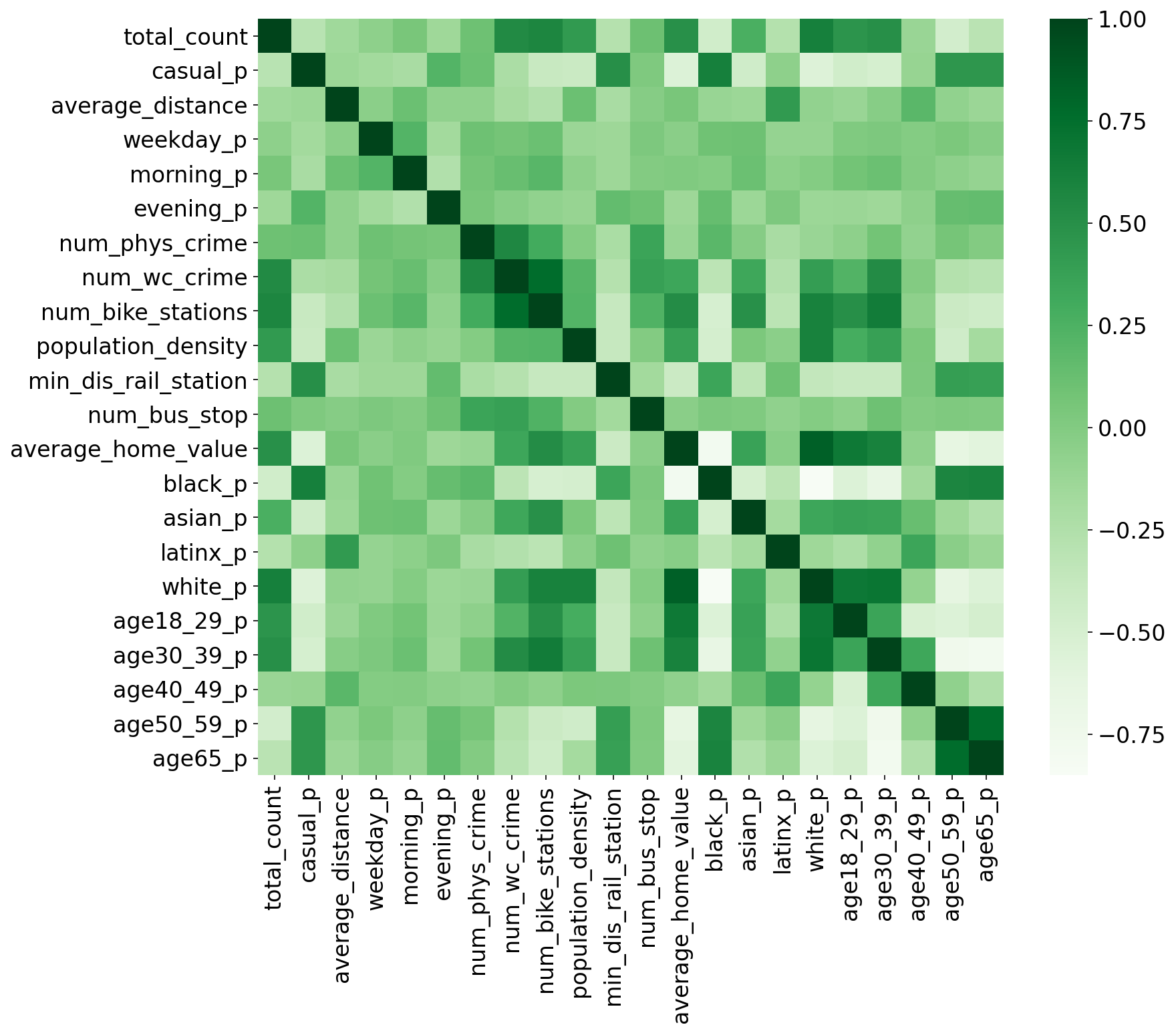
Figure P7: variable correlation heatmap

Results

To ensure interpretability, the project employs multivariate OLS regression models to test the hypotheses. Because the distributions of most variables are highly skewed, log transformation is applied on all variables for consistent interpretation, including the outcome variable. Table P8 shows the results of the two regression models. Model (1) contains all variables discussed in the six hypotheses. Model (2) represents the final model that only includes variables with statistically significant associations (p < 0.1) to the outcome. Both models have adjusted R-squared values of about 0.75, which means that the predictor variables in the models explained about 75% of the variations in divvy bike station volume usage.

Table P8: OLS regression results

Results for hypotheses Group 1: location and purpose

The result from model (1) provides no support for hypothesis H1a. It provides support for H1b, and suggests an opposite effect for H1c.

The coefficient for log(casual_p) is not statistically significant (p>0.1). It means that the results cannot identify clear associations between proportion of casual riders and station usage volume, controlling for other factors. There are three possible explanations: (a) high one-time payment percentage does not suggest that the station is located at tourist attractions, (b) locating at tourist sites does not lead to high volume of bike usage, (c) because the data is recorded during the covid-19 pandemic (April 2021), tourist sites did not attract as much visitors as pre-pandemic times.

The coefficient for log(average_distance) is -0.24 and statistically significant (p<0.01). It means that, controlling for other factors, a 1 percent increase in the average distance of trips that use the station (in the divvy bike station distribution) is associated with a 0.24% reduction in station usage volume.

Controlling for other factors, a 1 percent increase in weekday usage (in the divvy bike station distribution) is associated with a 0.35% increase in station usage volume, and a 1 percent increase in morning usage (in the divvy bike station distribution) is associated with a 0.17% increase in station usage volume (p<0.01). These results suggest an opposite effect from what we hypothesized in H1c. A possible explanation is that stations mainly used for commute or daily errands are associated with a higher volume of usage.

Furthermore, a one percent increase in the evening (9pm to 6am) usage (in the divvy bike station distribution) is linked with a 0.08% increase in station usage volume (p<0.01). It may be because stations that are used often in the evening are located in areas with good lighting, most likely in geographically important locations.

Results for Hypotheses Group 2: crime rates

The results in model (1) provide strong support for H2a and H2b. Controlling for other factors, a one percent increase in physical crime cases nearby (in the divvy bike station distribution) is associated with a 0.14% reduction in station volume. A one percent increase in white collar crime cases nearby is associated with a 0.15% increase in station volume (p<0.01).

Results for Hypotheses Group 3: local supply and demand

Results in model (1) provide support for H3b and suggest an opposite effect to H3a. Controlling for other factors, a one percent increase in population density of the zipcode in which the station is located is linked to a 0.36% increase in bike station volume (p<0.01). Meanwhile, a one percent increase in the number of other divvy bike stations nearby is also associated with a 0.04% increase in bike station volume (p<0.1). Network effect may be an explanation for the positive link between the number of other divvy bike stations nearby and bike station volume: having more bike stations nearby makes it more convenient for riders to use divvy bikes for short distance trips. The network effect also explains H1b, where stations with high average trips, which signals that they are far away from other stations (absence of network effect), are associated with low usage volume.

Results for Hypotheses Group 4: other public transportations

Results in the model (1) do not support H4a. Controlling for other factors, including population density, having rail stations or bus stops nearby are not linked to the popularity of bike stations (p>0.1). It may be because the complement and substitutes effects cancel out each other. Further investigation is needed to understand how and where these interactions took place.

Results for Hypotheses Group 5: socio-economic status

Results in model (1) show an opposite effect from H5. H5 expects an inverse U shape curve, which suggests that the stations in the middle class zip code areas are used more often than stations in wealthy or disadvantaged zip code areas. To my astonishment, the result suggests a U shape curve instead: as the average home value in a zip code area increases, the usage volume of bike stations first decreases, then increases (p<0.05) (see Figure P8). So far, I am unable to come up with a convincing explanation.

Figure P8: results on average home value vs station usage volume

Results for Hypotheses Group 6: demographics

Results in model (1) support both H6a and H6b. The preference of using public bike share varies by racial composition of the area. Controlling for other factors, a one percent increase in the proportion of asian population in the zip code area where the bike station is located (in the divvy bike station distribution) is associated with a 0.1% increase in bike station usage volume (p<0.05). A one percent increase in the proportion of hispanic population is associated with a 0.17% decrease in usage volume (p<0.01). A one percent increase in the proportion of white population is associated with a 0.35% increase in usage volume (p<0.01). Changes in the proportion of black population are not associated with bike station usage volume (p>0.1).

Having a greater proportion of young people in an area also increases public bike share usage. Controlling for other factors, a one percent increase in the proportion of population between 18 and 29 in the zip code area where the bike station is located (in the divvy bike station distribution) is associated with a 0.88% increase in bike station usage volume (p<0.01). A one percent increase in the proportion of population between 30 and 39 is linked to a 1.64% increase in bike station usage volume (p<0.01).


Table P9 summarizes the testing results of the 6 hypotheses groups.

Table P9: summary of the hypothesis testing results

Hypotheses variables (in log scale) hypothesized association with station usage volume whether supported by regression results
H1a proportion of casual riders (one time payment) positive No
H1b average trip distance negative Yes
H1c proportion of weekday or morning trips negative Opposite (positive)
H2a number of physical crime cases nearby negative Yes
H2b number of white collar crime cases nearby positive Yes
H3a number of divvy bike stations nearby negative Opposite (positive)
H3b population density nearby positive Yes
H4 distance to the nearest rail station, number of bus stops nearby positive No
H5 average home value nearby inverse U shaped curve Opposite (U shaped curve)
H6a racial compositions of population nearby exist association Yes (positive for asian and white, negative for hispanic, no association for black)
H6b proportion of young people nearby positive Yes

Next Step

In this project, I chose April 2021 as the month of analysis. An interesting next step is to look at the monthly changes in Divvy bike trip patterns before, during, and hopefully after the covid-19 pandemic. Feel free to email me if you are interested in collaborating on this project.

[Back to Top] [Email me Comments] [Back to Projects]